Contents
About the Free Template to Run Cross-tabs in Excel
In today’s analytical world, days marketers are expected to analyze significant amount of customer database and market research survey data – and an effective skill is being able to run cross tabs in Excel.
A simple, but powerful, approach to initially analyzing the data is to run visual charts for each of the questions/variables, followed by cross-tabs of key variables of questions.
While this functionality is available in Excel through a pivot table, it is difficult to use at times, or create some confusion, unless you are quite experience with using Excel. Therefore, a very simple to use charting and cross-tab template has been provided by the Marketing Study Guide.
- Download the free Excel template here… cross tab and count data
- Or learn how to make your own cross-tab template in Excel: How to Make Cross-tabs in Excel
Capability of the Cross-Tab Excel template
As you will see when you download it, the template allows you to:
- Enter up to 60 questions/variables
- Enter up to 10 possible responses for each question/variable
- Enter up to 2,000 respondents/customers/records for each of the questions/variables
- Automatically produce frequency graphs for each variable
- Automatically produce cross-tabs for any of the questions
How to Use the Cross-tab Excel template
Please note there is a four-minute video below as well.
When you first download the file (above), it will open at the “Info” worksheet tab once you have enabled it. This simple tab basically says to work through the other tabs in the worksheet in sequence.
Step 1: Set-up Your Data Labels and Codes
This means that you will immediately start on the “Data Set-Up” tab, which requires you to type in the names of the questions and/or variables you are using. In other words, label the data and how it has been coded. Here is an example:
As you can see above, you have three data fields to complete for each question/variable. The first is a simple name – the example above is for a brand loyalty segment (column 2), on a 1 to 5 scale (column 4), with each number is referring to a level of brand loyalty, which is outlined in column 5.
This information will be produced charts annual cross-tabs automatically. Please note: it is very important that column 4 matches how your data has been coded or captured. In many cases it will be numeric, but occasionally it could be some form of text.
Step 2: Copy/paste your Data
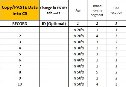
Now we move to the next tab, which is labelled “Data Entry”in the template. The question/variable labels that you entered in Step 1 will carry across automatically. And now you all you need to do is to copy/ paste your data into the spreadsheet, as shown below.
Remember that the free template allows you to enter up to 2,000 records.
You may have some form of ID number, which you may also copy into the spreadsheet for your information. However, if you are just pasting your data only, as indicated above, you just copy and paste into cell C5.
And that’s it – you are ready to analyze and review cross-tabs very quickly.
Step 3: Produce frequency charts for any question you like
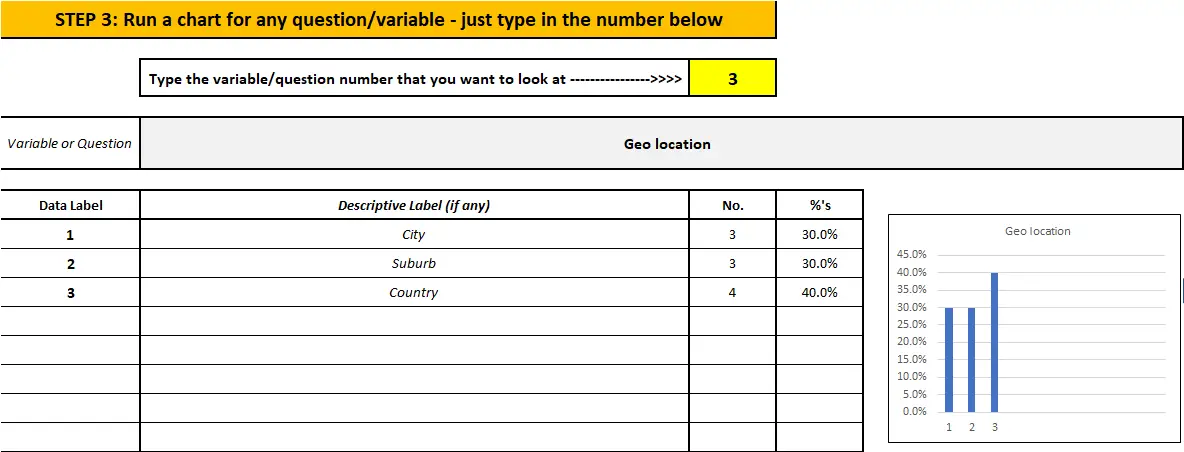
The next tab is labelled “Run Charts”. Everything you have entered is automatically carried across. Then all you need to do is type in the question/variable number (up to 60, depending upon your data set) – and the template automatically produces a chart for you.
If the graph is of interest to you for your analysis, then you can copy and paste it into the “blank” tab in the worksheet for later review and reformatting, if required.
Here is an example, but please note that a larger chart is produce underneath as well.
Step 4: Run Excel Cross-tabs
Now we move to a deeper level of analysis, by running cross-tabs on your data. Again, everything carried across and is already set up for you, so you only need to type in the question/variable number and the cross-tab will be automatically produced.
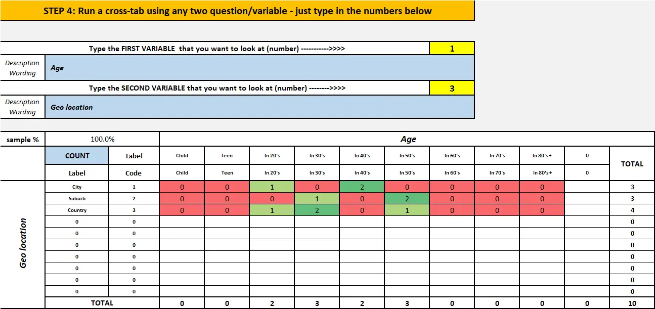
Here is an example of a cross-tab table as produced by the template:
All you need to do is type in the two variable numbers that you want to review into the yellow cells. In this example, we are cross-tabbing variable 1 with variable 3. This produces a cross-table as per above.
For simplicity, we only have 10 records being analyzed. A heat map is produced to identify the more common connections between these two variables – green being the highest number in the cross-tab table, down to red being the lowest.
This allows very quick review of your cross-tabs, especially if you have up to 60 variables, and you want to review lots of possible relationships and associations. Luckily, with the structure of this free Excel template, you could crunch through the cross-tabs for 60 variables very quickly.
Again, if the table is of interest to you in terms of your analysis, you can copy and paste it into the blank tab in the worksheet.
A few more tables for the cross-tab analysis
On the same worksheet tab where you are running the cross-tabs, it automatically produces four tables for you.
The first is listed shown above, and is the cross-tab output on a frequency basis. However, if you scroll down on that worksheet, immediately of this table on a percentage basis, which probably will be a more effective form of analysis. Again, there is an automatic heat map provided – which naturally would match the first cross-tab table.
The other two tables show the percentages in the cross-tab for each of the two variables – that is, adding to either 100% down (for the variable on the horizontal row of the table ) or 100% across (for the variable on the vertical column of the table). Again, these additional percentage output for the cross-tabs will be helpful in your analysis of the database or survey results.
Video: How to Use the template to run cross-tabs in Excel
What are Cross-tabs and Why Marketers Need to Use Them?
Cross tabs, also known as cross-tabulations or contingency tables, are a statistical tool used in market research to analyze the relationship between two or more variables.
It is a method of summarizing and displaying data in a matrix format to understand the interactions between different categories or groups.
In market research, cross tabs are commonly used to examine the relationships between demographic variables (such as age, gender, income, education) and various consumer behaviors or preferences (such as brand preference, purchasing habits, satisfaction levels).
For example, let’s say you want to analyze the relationship between age and brand preference.
You would create a cross tabulation by placing age groups (e.g., 18-24, 25-34, 35-44, etc.) in the rows and brand options (e.g., Brand A, Brand B, Brand C) in the columns.
The table would show the number or percentage of respondents from each age group who prefer each brand. This allows you to visualize and compare the brand preferences of different age groups.
These insights can help businesses understand their target audience better, tailor marketing strategies, and make data-driven decisions.
Academic Reading and More Tools


